ShapeKit Studio
The purpose of ShapeKit Studio is to create what we call a Design, starting from a well-formed training data set, created by ShapeKit Loader.
You can perform miscellaneous analysis on data (both input and output), apply different kind of preprocessing, compute various type of models (linear, non linear) and most importantly, compare and analyze them. You work within a user friendly graphical workbench and you can save intermediate states in files called sketches, with extension .Sketch. Those files can be stored on hard disk and exchanged with other people.
Once you have finished, you can export your Design in a file with extension .Design.
Canvas
The whole setup is represented in the bottom part of the screen, called canvas, and some information are displayed on the top. The canvas is the place where all actions are taken, using the mouse.
Three kind of objects can be found on the canvas:
- (part of) training data set. Both parts (input and output) of a training data set are displayed with a different object. All other steps are placed between them.
- preprocessing steps, which can be done for both input and output data. An input preprocessing step will read its data from the left and provide the result on the right. An output preprocessing step will read its data from the right and provide the result on the left.
- models: either linear or nonlinear.
All objects have tooltips providing the most important information about them, hover your mouse cursor over an object to display the tooltip.
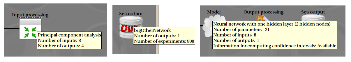
Tooltip examples. The first line displays the name of the object. Left: a preprocessing step (here Principal component analysis). Center: the output part of a training data set. Right: a model.
When you double-click on an object, a dialog opens with a detailed view of all its properties, most of which you can modify.
All actions are performed using the right-mouse button, also known as contextual menu, as is usual in current software. If you want to create, delete or edit an object, right click on it. The entries in the menu that will open depends on the whole existing canvas and will only propose you the relevant actions.
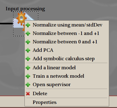
Contextual menu: you can add a preprocessing step from the first part and construct a model from the second part. Properties does the same as double-clicking, and Delete is obvious.
Overview of Design creation
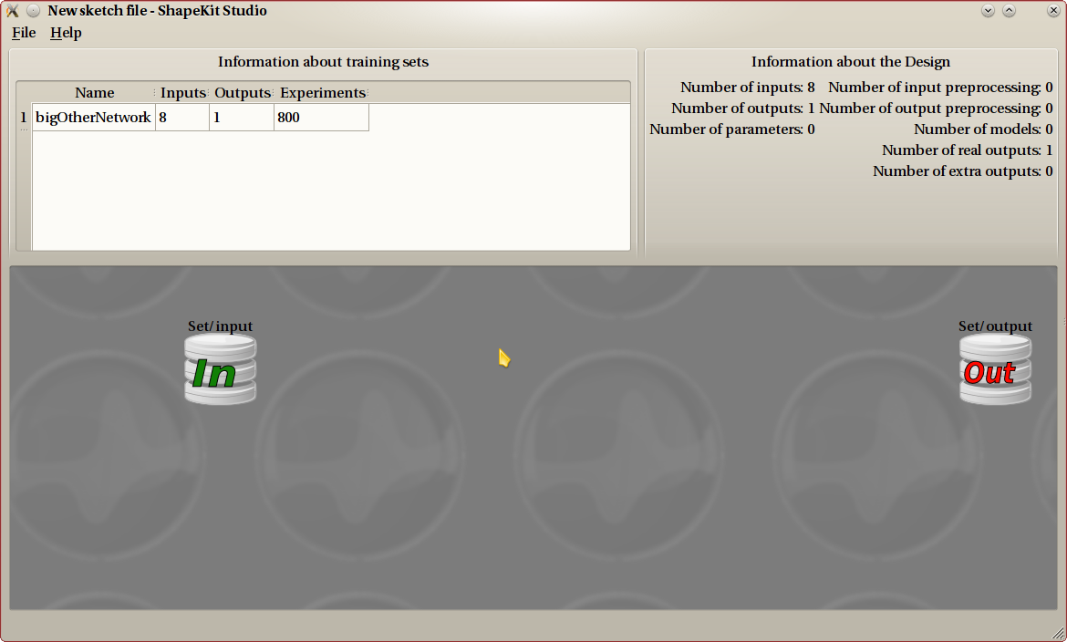
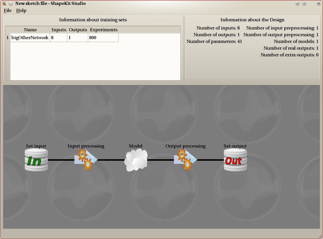
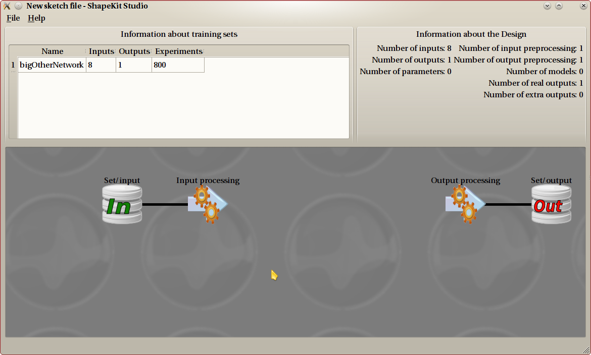
At the very beginning, once you have loaded the training data set, you get a Canvas that looks like this one.
Once the Design is started, you will most probably add some preprocessing steps to both input and output, and get a canvas that looks like this.
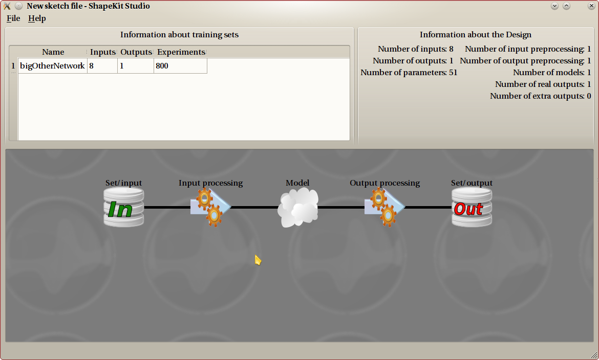
As a last step, we have added a model, that connects input and output. We now have a finished Design that can be exported to a Design file. This example is the most common one. A Design can be a lot more complicated.
The main idea is that a Design creation goes from the data toward the model. The training data set contains input and output data, and those are displayed on the very left (input data) and very right (output data) of the canvas.
We can apply several preprocessing steps on both input and output data. Preprocessing steps for the input data will line up from left to right, and preprocessing steps for the output data will go from right to left. Once all preprocessing have been added, you create models on the center. Models connect (possibly preprocessed) input and output data.
Take great care not to confuse model creation with data flow. While creating the Design, you add steps from the outside toward the center of the Canvas. But the data flow always goes from left to right. Once the Design is created, the input data is applied on the very left, flows through the Design in order to compute the output on the very right part of the Canvas.
Most of the time, your Design will have the very archetypal following layout:
input->preprocessing for input->model->preprocessing for output->output
A slightly more generic layout is:
input->(zero, one or more preprocessing for input)->model->(zero, one or more preprocessing for output)->output
Other layouts are possible, but are considered very advanced use. You really should thing twice before using them. It is possible to fork input data. That means, creating two nodes starting from the same input node, such as in the following example:
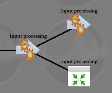
This can be useful when several models are present. Note that this is not mandatory: you can have several models and still use the same preprocessing queue for all of them. Forking output data is not possible, because this has no meaning. Remember that data flows from left to right. You can create two outputs from the same input, but not one output from two different inputs.
Data sets
To start creating the Design, you need to provide a training data set. Even if it is possible to have several training sets (such as when two Design are merged together), most of the time you should not be concerned by this, and you can consider that only one set can be used.
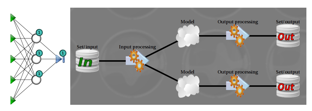
In this example, the training set has 5 inputs and 2 outputs. Here, we use a split scheme: two models share the same input nonlinear model (displayed on the left), and the other one is a linear model (not displayed).
The training set (and hence, the final Design) can have one or several outputs. Most often, only one output is present, and this is the easy case. If there are several outputs, Designs are more difficult to understand and to construct. You will have to make a choice, between using a model for each output, or one model for all outputs. Both can make sense, depending on the context.
One model for each output is the easier to understand: this is the same as creating n Designs, but sharing the same input data.
Using one model with several outputs allows the model to better understand the interaction between outputs, which often have a physical meaning in the original process being studied. On the other side, it is not possible in this case to have the information needed to compute the PRESS and confidence intervals, which significantly reduces the deepness of analysis that can be performed.
Splitting outputs is a choice you need to do at the very beginning. This action is available from the contextual menu for an output training set with more than one output.
This example uses the same training set as in the previous figure. The outputs are not split. The underlying model (on the left, described on the tooltip) has two outputs.
When editing a set properties, the mean, min and max values for each column are displayed. You can change the whole set name on the top, and each column name by double clicking on the name in the table.
Normalization
Normalization is the most basic kind of preprocessing, and also the most useful. If you are not yet very familiar with data modeling, your best bet is to normalize both inputs and outputs, and not add any other preprocessing.
Most algorithms for computing models perform a lot better when the data provided is normalized. Normalization helps improving speed, stability and precision of such algorithms.
Normalization steps apply a basic affine transformation independently on all inputs. This object hence has the same number of outputs as inputs. Three kind of normalization are provided.
- Using mean and standard deviation: the resulting set has a null mean, and a standard deviation of 1. This is the most commonly used.
- Between 0 and 1: transform the input so that the minimum value is 0 and the maximum value 1.
- Between -1 and 1: same as previous, but with a symmetrical min/max.
Principal component analysis
The purpose of principal component analysis (or PCA) is to get an idea about the correlation of input variables, and if necessary/possible, to reduce the number of input variables. This is called dimensionality reduction.
In an ideal world, inputs are carefully chosen by a specialist of the studied field, and are not correlated. This preprocessing object is here to check and maybe fix this.
Having too much input variables harms model construction in several ways. It can disturb algorithms, making them converge to a less optimal solution, or converge more slowly. But most importantly, the speed of computing is directly dependant on the number of input variables. Hence speed is penalized at two levels: computation, and algorithm.
This figure shows an example. The eigen values from the PCA are sorted in descending order and displayed on the top-left table. The idea is to only keep the relevant one, and the difficulty is to decide which one are relevant. The eigen values are to be compared relatively to each other, this is why the bottom chart displays a (logarithmic) view of those ratios.
The top-right corner is where you select which eigen values to keep. That is, to decide how many outputs this preprocessing object has.
You can choose the number of components, the percentage of components, or the ratio. When you choose any of those settings, the other ones are updated accordingly.
The default behaviour is to keep all eigen values. Even in this case, using the PCA makes sense, because entries are as decorrelated as possible, which can help model creation.
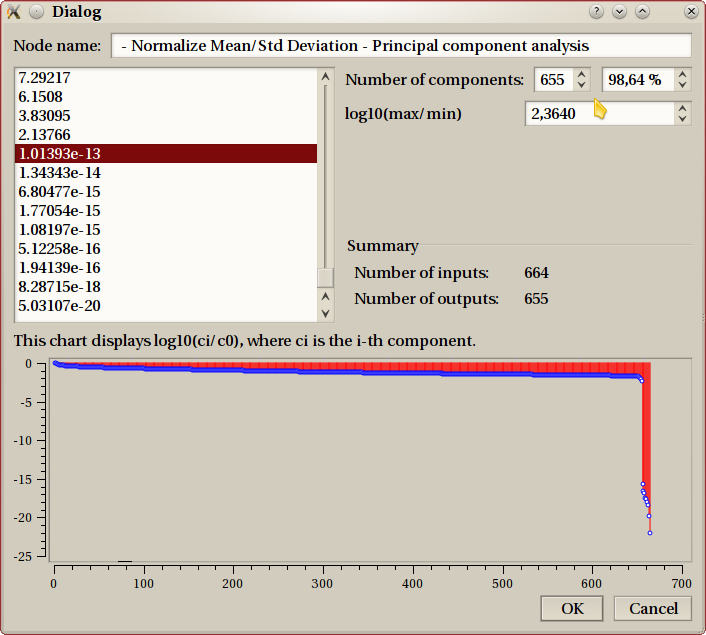
When input data indeed contains strong correlation, the bottom graph usually has a drop, such as the one in this example. The last 9 points are clearly of insignificant importance compared to the other ones. This is usually the point where you decide to ‘cut’.
This example is very extreme (very few realistic real-life examples have 664 inputs), and doesn’t benefit very much of PCA, as we still keep 655 values (>98%).
Symbolic calculus step
This steps allows to make any deterministic transformation on inputs, using formulas provided by the user. This object can have as many outputs as wanted, and all outputs can depend on all inputs. A formulor
The default setting is to have as much outputs as inputs, with each output equal to the corresponding input. This default object does nothing as is and is useless until modified.
It is not possible to use a symbolic calculus step on outputs. This is because this step needs to be computed in both directions: from right to left in order to compute the training data provided to the left object (usually a model), and from left to right in the final Design. Mathematically, this means being able to check that the function has an inverse, and to actually compute this (symbolic) inverse function, which is not possible in such a complicated case, where each output can depend on all inputs.
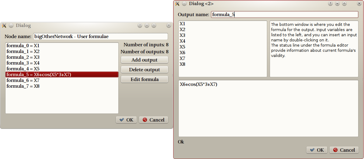
Dialogs for the symbolic calculus step
Let’s detail the example displayed on the figure. The left dialog is the property dialog for the symbolic calculus step, and displays all current outputs. The actions are on the right. The right dialog is what you get if you select the ‘formula_5’ output and then click on ‘Edit formula’.
As explained in the top-right part, you construct the formula on the bottom part, using input names (listed on top-left) and all classical functions. Here is a list of known functions:
- exp, log, log10, sqrt, erf
- cos, sin, tan, acos, asin, atan
- cosh, sinh, tanh, acosh, asinh, atanh
Linear models
The term ‘linear’ is misleading here. Linear models represent a trade-off to, barely, create a model where outputs depends non linearly from inputs, but still using linear techniques.
To achieve this, a common trick in mathematics is to use functions that are non linear, but easy to work with, namely polynomials. Inputs are first transformed through polonium’s, and then a linear matching is made with respect to those secondary variables. This is exactly how ShapeKit Studio will display it: the first step is displayed as preprocessing with name Polynomial preprocessing. This step is ‘clueless’, in the sense that it has no parameter. The second step is the linear matching, represented with a (linear) model. The use of normalized inputs is of paramount importance here.
Creating the polynomial secondary variables has a cost: the number of inputs for the model is usually a lot higher.
Here is the configuration dialog you get when asking to create a linear model.
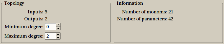
You have to choose the minimum and maximum degree for monomials. The number of monomials (or secondary variables) only depends on the number of outputs and the minimum/maximum degrees. It is displayed on the right panel. The more parameters there are, the more precise will be the model, but of course, computing the model will take more time to compute, and more memory.
Here are some more details about the example depicted in this image. There are 5 inputs, we call them a, b, c, d and e.
The maximum degree is set to 2, this means than all monomials of degree between 0 and 2, for all input combinations are to be considered, here is the list:
- 1 monomial of degree 0 : 1
- 5 monomials of degree 1 : a, b, c, d, e.
- 15 monomials of degree 2 : a2, b2, c2, d2, d2, a*b, a*c, a*d, a*e, b*c, b*d, b*e, c*d, c*e, d*e.
Those are 21 monomials, as specified in the right panel. As a result we have a Polynomial preprocessing with 5 inputs and 21 outputs, and a linear model with 21 inputs and 2 outputs. There are 21 parameters for each output, for a total of 42 parameters.
The minimum degree is usually 0: this corresponds to only one function: the constant ‘1’, often referred to as bias. There are some really few cases where it is better not to keep the bias, this is why ShapeKit Studio allows to set the minimum degree to something different than 0, but until your really know what your are doing, you should not change this parameter.
Non linear models
Non linear models (also known as artificial neural networks) needs to be trained, and this is the more critical part of such a model creation.
This creation is done in two steps. The first one decide upon the model topology, from a configuration window much like the one for creating a linear model. As seen on figures, there are two modes: a simple default one, that should fit most users, especially those unfamiliar with such techniques, and an expert mode, providing all features.
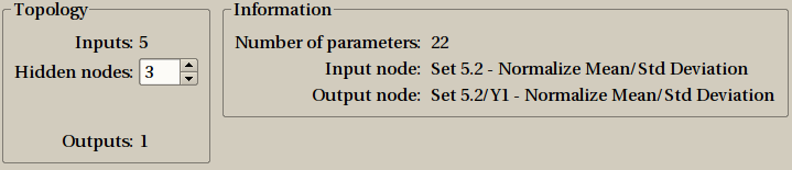
The default setting window for creating a non linear model is simple: you just need to select the number of hidden nodes, which condition the number of parameters.
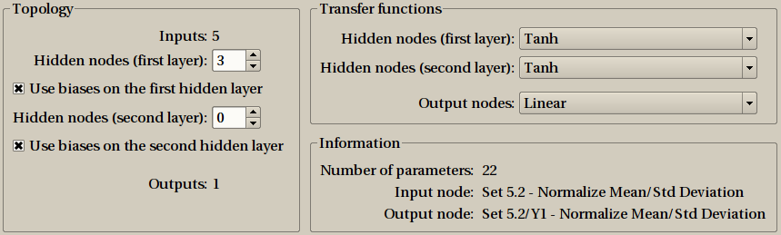
The expert mode provide the full range of configuration options.
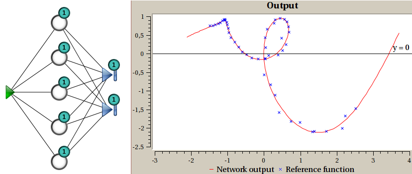
A representation of the model is displayed, and updated in real-time when you change the configuration, in order to provide a visual feedback to the user. You can hover your mouse over nodes: tooltips will provide more information such as the transfer function used in this node.
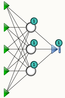
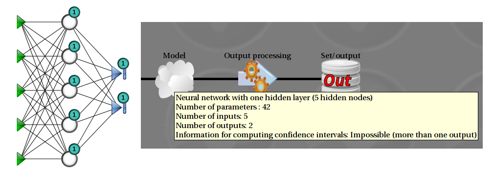
Representation of a non linear model. The green triangles represent inputs, the blue triangle is the output node, the white circles are the hidden nodes. The “1” means that the node is connected to a bias (a constant input). The number of parameters is the number of black lines (connections) plus the number of biases. In this examples, there are 18 + 4 = 22 parameters.
The second step is to train the network. Training consists in using some random initial parameters, and then to use an optimization algorithm to change those parameters so that the model fit the training data as well as possible. You usually perform several attempts to compare and choose from.
A dedicated window will open for this purpose. The actual training is done using four actions, available from the Training menu and the toolbar. Once you get used to it, the key bindings are really the more efficient way to go.
- reset will initialize parameters to new random values and clear all windows.
- do one step will apply one optimization step and update all windows.
- start will tell ShapeKit Studio to keep on optimizing until either a final condition is met, or the user stops it. For efficiency reasons, windows are not updated for all steps, but only from time to time.
- stop stop a running optimization, and update all windows.
If you happen to be happy with the current parameters, you can insert the model in your global design, by selecting the appropriate menu entry in File. From there you can also cancel the model creation altogether.
Training a network by yourself may be a little tedious, and this is why most of the time, instead of doing it this way, you shall use the supervisor. It still makes sense, though, to use the training window in certain circumstances, to gain some feelings how various kind of model reacts to training and to check whether the problem is easy or not.
While performing a training, several analysis sub-windows can be displayed. Some of them are opened by default, others are available from the Sub windows menu.
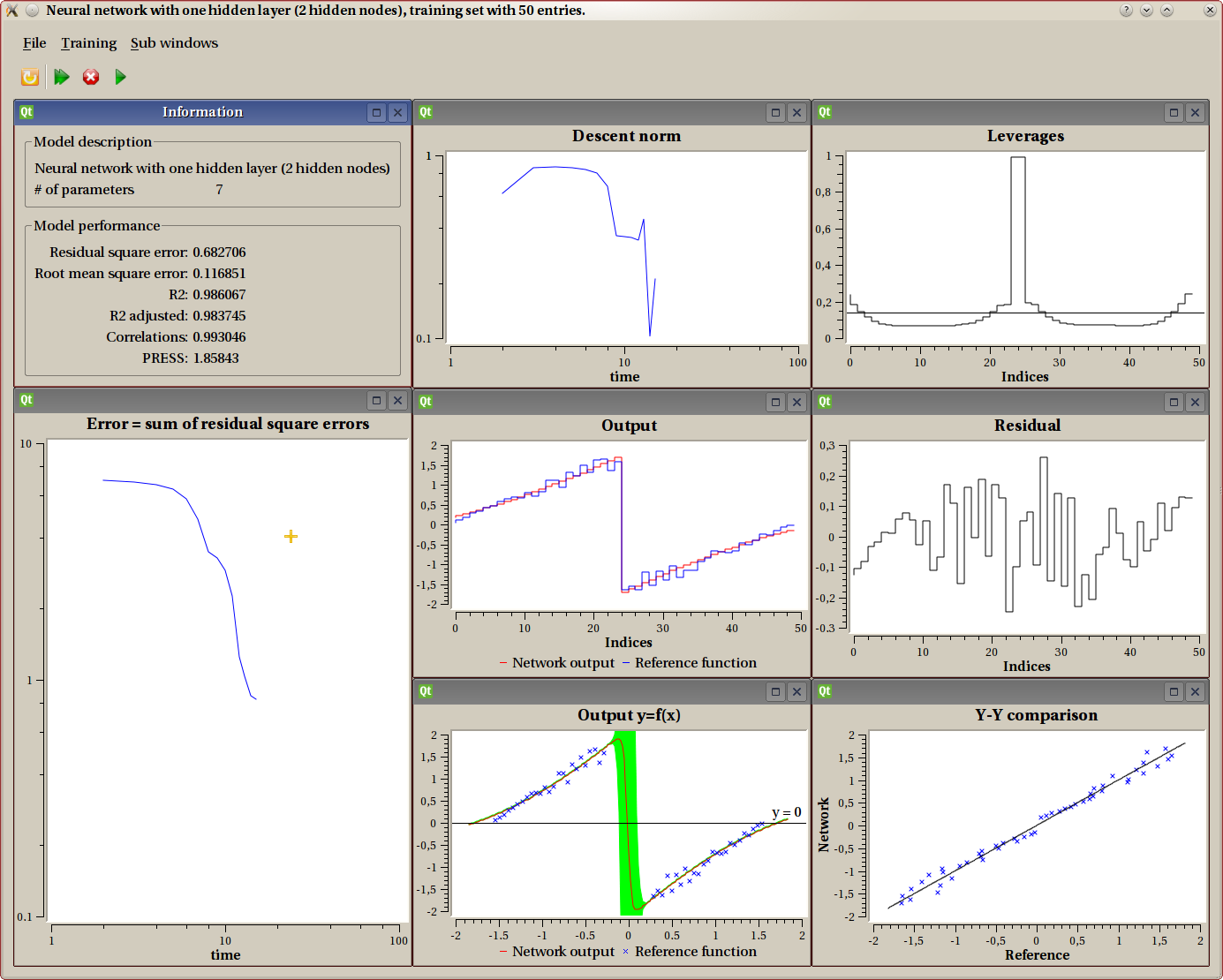
Information
This sub-window displays a summary describing the model and some indication to evaluate the performance of current parameters.
X-Y graph
This one is only available for models with exactly one input and one output. It displays both the training data and the model as a function “y=f(x)”. The training set displays as discrete points, while the model produces a continuous curve. When possible (such as in this example), the confidence interval is displayed as a green shape around the model output. Here we clearly see that around the discontinuity, the model is not to be trusted for accuracy, which is expected. This uncertainty can also be observed on the leverage graph.
Y-Y graph
This one is only available for models with exactly one output. The actual output of the model using current parameters is compared values from the training set. Each output is using one axis (X=training set, Y=network output), and a perfect model will have all points on the diagonal.
Residual
This one is only available for models with exactly one output. It displays the residual for every input value (indices on the X axis). The residual is the ‘error’, that is the training set value minus the current model output.
Outputs
This one is only available for models with exactly one output. Both the actual output of the model using current parameters and the value from the training set are displayed on the Y-axis for every index from the training set (as X axis).
Display output
This sub window shows the graphical representation of the nonlinear model, as described previously.
Leverage graph
This one is always available. It displays leverages, which are an indication of the importance of one experiment in the overall process. The X axis is the index of experiment. We know from the theory that the leverage mean is exactly the number of parameters divided by the number of experiments. This value is displayed as an horizontal line. Leverage values are always comprised between 0 and 1.
Leverages are a good indicator for the quality of the model. If you don’t know what this is, you really should read some good documentation about it. As a summary, we could say that a good model has all leverages not very far away from the mean (horizontal line). A bad model will typically have some very high values and some others very low: this model is over trained.
In the example displayed, we see that the leverages for the two points before and after the discontinuity are big (almost 1). This shows that the model parameters are highly dependant upon those points. This shows that the model can not understand the exact shape of the discontinuity.
Error graph (sum of residual square errors)
This graph displays the error over time. The ‘error’ is defined as follow:
- for each output, the residual is computed (actual output-value from training set)
- for each output, the square error of the residual is computed
- the error is the sum of all those values
This graph uses logarithmic view for both the X and Y axis. It is common for people new to the field to consider this as the ultimate criteria, but it is not. It still is a good indicator though.
Descent Norm
This one is rather technical, and not often very useful for the end user. It displays the norm of the descent vector for each step.
X-YY graph
Example of X-YY graph, with the corresponding model.
This one is only available for models with exactly one input and two outputs. It displays both the training data and the model as a parametric function “(x,y)=f(input)”. The training set displays as discrete points, while the model produces a continuous curve.
Extra outputs
It is sometimes useful to add outputs to the overall Design, which are NOT obtained from a model, but computed from existing outputs.
Examples of such extra outputs are
- output meant to check for a certain condition
- statistical information (min, max, mean)
- complement output: there are cases where there exists a relation between outputs. Typically, in creating a model predicting component weights in some chemical reaction, we know the total weight is unchanged, and hence, only n-1 outputs should be computed, the last one can be inferred. An important note here, is that this would be an ERROR to compute a model with n outputs here: the outputs are correlated.
This works like the symbolic calculus step: you can provide any function through an editor. Currently, you can only use output variables, but it is planned to add support for input variables as well.
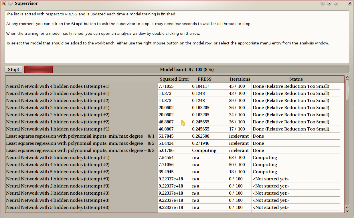
Supervisor
The purpose of the supervisor is to create several models, either linear or nonlinear, and to compare them. This allow to:
- compare linear versus nonlinear models.
- compare models with different settings (polynomial order, number of hidden nodes).
- compare different (random) initialization for nonlinear models.
The three step process is obvious: you first select which models should be tested, using a wizard very similar to the dialog used to create linear or nonlinear models.
The supervisor is then displayed and training on linear models is started right away. The list of models is sorted in real-time, related to the PRESS. Other performance evaluators are also displayed. At any time, the user can double click on en entry, this will open an analysis window, with the same tool described in the Non linear models part. Several analysis window can be opened simultaneously.
Finally, the user decides which model should be included in the Design by using the menu entry in the File menu from the analysis window.
The next image shows an example. The red progress bar at the top shows how much training needs to be done. The list contains all models, sorted according to the PRESS value. The model yet to be trained are at the end. You can see some of them on this example a the bottom of the window. You will notice a linear model that is computed, but for which the PRESS value is not yet available (“Computing..”), and three nonlinear model being trained. The supervisor detects and uses multicores and/or multiprocessors: the computer on which this screenshot was taken has a 4-core processor.
Design file
At any time, you can save your current work in a Sketch file. A Sketch file contains your work in progress, as displayed on the canvas. This includes the training data set, which is obviously needed for futher model creation.
What you have on your canvas, though, might be incomplete: you could have created a model for one output only, or you only have worked on preprocessing but not created any model yet. What you have on your canvas is not yet a full Design, this is why we call this a sketch.
Once your work is done, you can create an actual Design file, from the File menu. In order to do this, ShapeKit Studio will perform some tests in order to enforce correctness and completness for the Design. In case one of the criteria is not met, the Exploiter can not create the file, and will explain the problem in a dialog window. Typical tests are
- all input nodes are used.
- all outputs have a model attached, maybe with preprocessing in-between.
- there is no ‘dangling’ preprocessing (node whose output is not used).
Once this validation is done, the Design file is created. This file contains all that is needed to compute outputs from inputs. The training data set is NOT included in this file. This is the final result of your model creation. Doing something useful with this product is the goal of ShapeKit Exploiter.
The chapter named File formats contains more information about those file formats.
Hints
Here are some hints when creating a Design:
- There are few cases where it makes sense NOT to apply normalization steps to input data or output data. Unless you really know what you are doing, we advise you to include such normalization steps. If you don’t know which one to use, take the first one, “Mean/Standard deviation”.
- When creating a model, a common way of doing is to first use the supervisor using a broad range of different models (linear/nonlinear, number of parameters) but a small number of tests for each kind of model. This will tell which model is the best. You can then restart the supervisor using only this model, with a higher number of tests, so as to find the best parameters for this model.
- If a column is not needed, the best thing to do is to remove it from your spreadsheet or from the ShapeKit Loader. But it might be that for a given output and only for this one, not all inputs are needed. You can use the symbolic calculus step to do this: just remove the unwanted entries.